Gallery of Graphs
All the original graphs, and more, from the essay series ~ Vaccine Evangelists, Apostates, and Apologists ~ gathered in one place.
For easy reference I have gathered together, and presented on this page all the graphs that I created for the essay series Vaccine Evangelists, Apostates, and Apologists.
Also presented here are graphs that I made, but never ended up actually including due to space considerations (such as graphs for whooping cough, measles, and scarlet fever, in Belgium, Northern Ireland, New Zealand, Glasgow, and New York City).
Note! Opening the images on this page will probably not function when read in your email, but will function from a web browser. All the graphs show up as square thumbnails - click on the thumbnail for a medium view, and right click and open image in a new window for a large/high resolution view.
Some General Notes:
All the graphs that I created may be freely shared and reproduced in blog posts and articles. Links directly to the publicly available sources from which I pulled the data for these graphs are provided in each section.
The graphs that I shared in the Vaccine Evangelists, Apostates, and Apologists essays which are from other authors are not reproduced here, instead links to those author’s pages are provided on this webpage, (The exception being some screenshots from the WHO and from Analysis of Health in Spain Across the 20th Century, which I did include here).
Most all these graphs are mortality graphs for the reasons discussed throughout the Vaccine Evangelists, Apostates, and Apologists essay series.
The presentation of the graphs is by country or city, in order of oldest data sets first (except for Northern Ireland, which I wanted to keep next to the rest of Ireland).
In these graphs juxtaposing historical mortality with vaccination for various countries and cities, I focused on three illnesses - whooping cough, measles, and scarlet fever, though for many places one, up to many, other disease are covered too.
To my knowledge scarlet fever vaccines were not used systematically, in any of the below locations, nor incorporated into national vaccination programs, which allows scarlet fever to serve as a no vaccine control.
Scarlet fever often ceases to get it’s own category in most the statistical yearbook tables sometime in the later half of the 20th century, usually right around when scarlet fever deaths reach zero or close to zero per year, hence the reason for the scarlet fever graphs presented here ending at earlier dates.
Contents
Belgium 1851 to 2018 — Whooping Cough, Measles, Scarlet Fever, Diphtheria
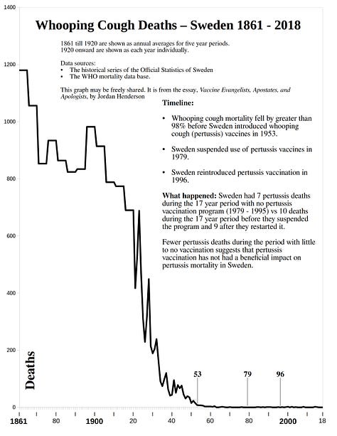
Sweden 1861 to 2018 — Whooping Cough, Measles, Scarlet Fever, Diphtheria
Ireland 1864 to 2015 — Whooping Cough, Measles, Scarlet Fever
Northern Ireland 1912 - 1995 — Whooping Cough, Measles, Scarlet Fever
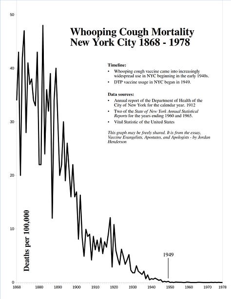
New York City 1868 to 1978 — Whooping Cough, Measles, Scarlet Fever
Norway 1869 to 2016 — Whooping Cough, Measles, Scarlet Fever, Diphtheria
New Zealand 1881 to 2016 — Whooping Cough, Measles, Scarlet Fever, Diphtheria, Typhoid Fever, Pulmonary Tuberculosis.
Glasgow, Scotland: 1881 to 1970 — Whooping Cough, Measles, Scarlet Fever.
Italy 1887 to 2003 — Whooping Cough, Measles, Meningitis, Influenza, Pneumonia, Bronchitis, Child Mortality.
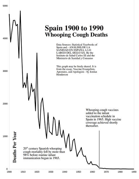
Spain 1900 to 1990 — Whooping Cough, Measles, Scarlet Fever, Diphtheria, Typhoid Fever, Tuberculosis, and many others.
Some graphs for the USA, one for France, a couple for Switzerland, & miscellaneous graphs — Infectious disease mortality in the USA (tuberculosis, diarrhea and enteritis, diphtheria, scarlet fever, measles, and whooping cough), diphtheria in France, a meme, an infographic, and measles and scarlet fever in Switzerland from 1876.
Selection of Graphs as Black and White Line Graphs for Easy Printing (minimal ink needed to print them).
Links to web pages with historical mortality graphs for more countries and places.
Belgium 1851 to 2018
Left to right
Top Row - whooping cough - big picture view, and detail view.
Bottom Row - measles - big picture view, and detail view.
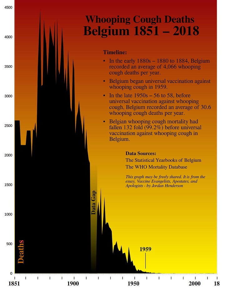
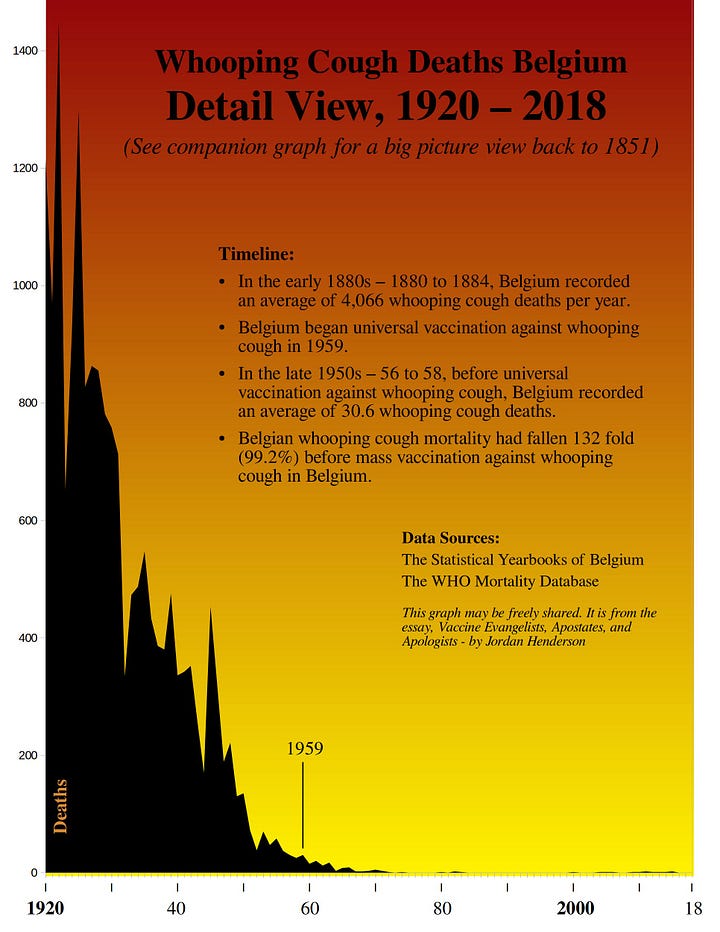
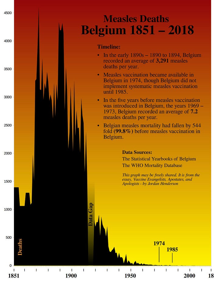
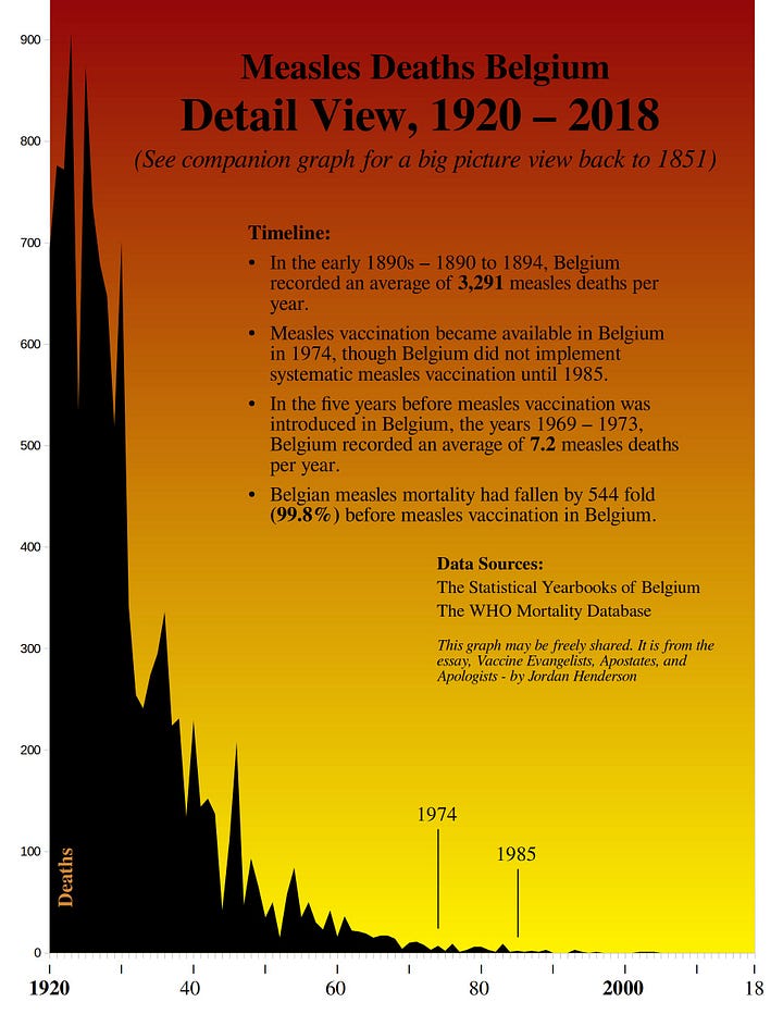
Belgium Continued:
Left to right
Top Row - scarlet fever - big picture view, and detail view.
Bottom Row - diphtheria - big picture view, and detail view.
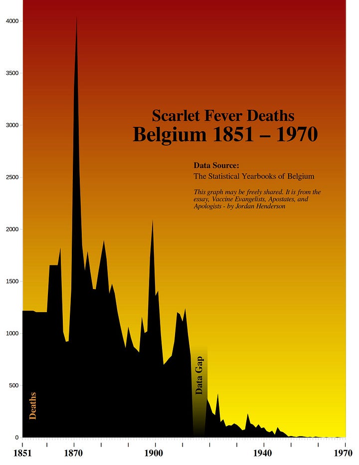


Links to data sources:
The Statistical Yearbooks of Belgium.
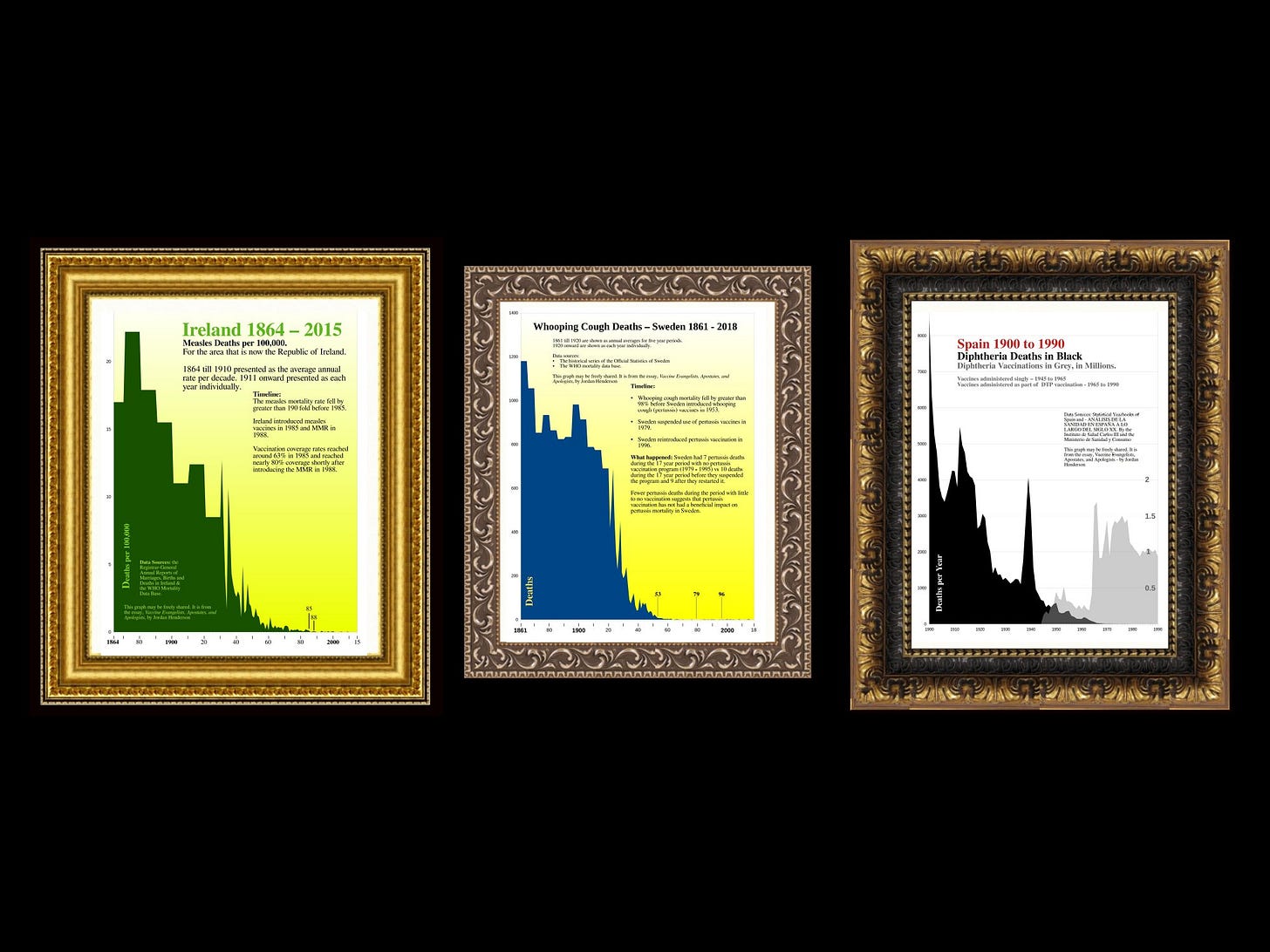
Sweden 1861 - 2018
Left to right.
Top Row - 1. whooping cough back to 1861. 2. whooping cough detail. 3. whooping cough case notifications.
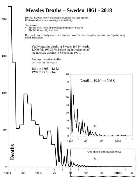
Middle Row - 4. whooping cough cases (in thousands) and case fatality rates. 5. measles.
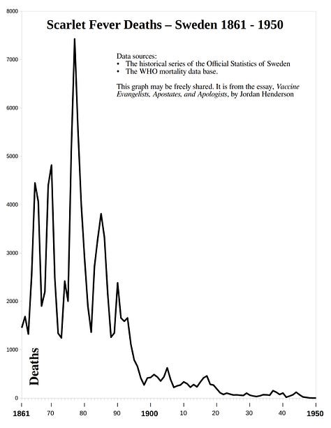
Bottom Row - 6. scarlet fever. 7 Diphtheria.


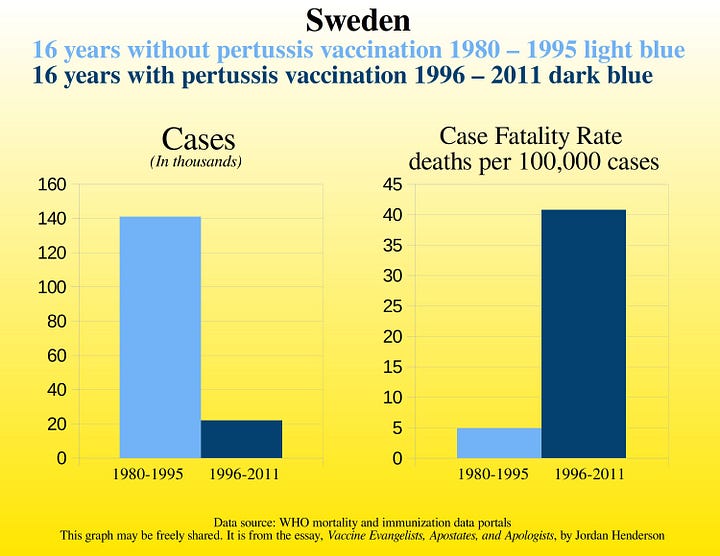
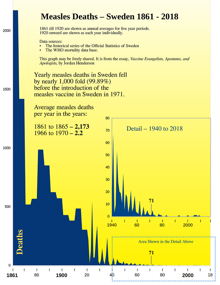
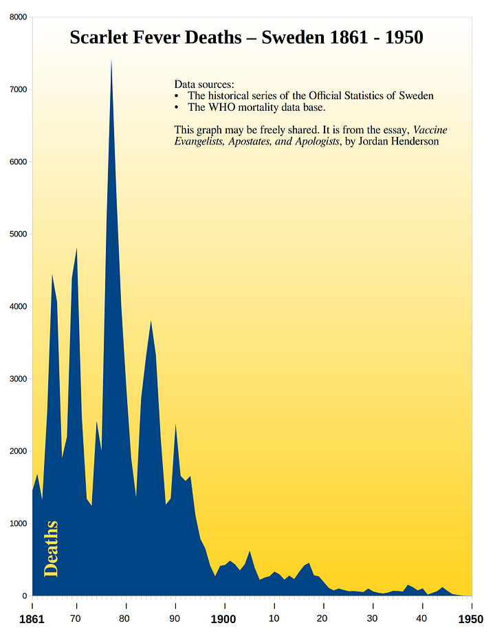
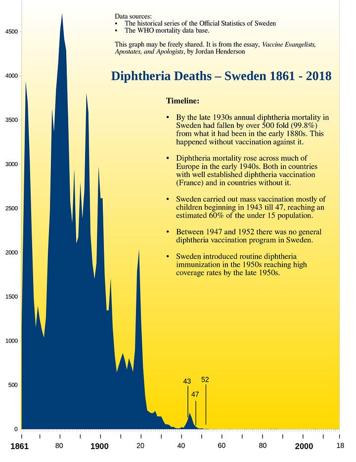
Links to data sources:
Historical Series of the Official Statistics of Sweden.
Ireland 1864 - 2015
Left to right - whooping cough, measles, scarlet fever.
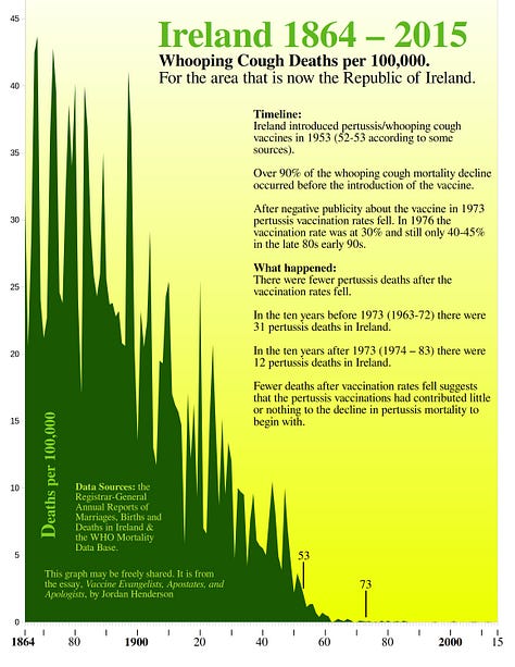
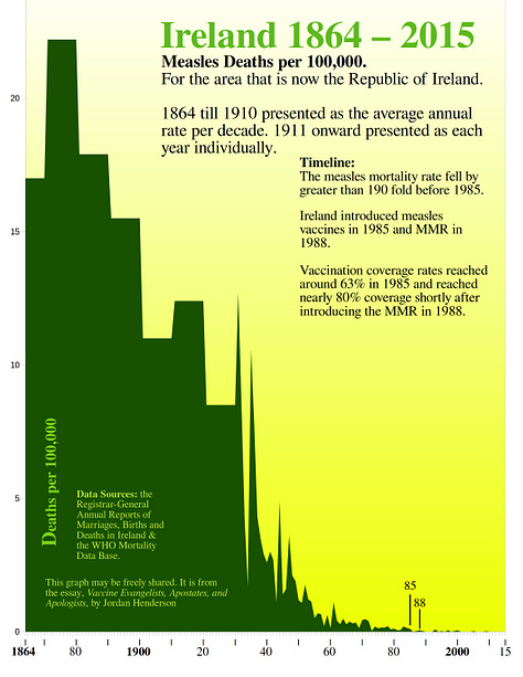
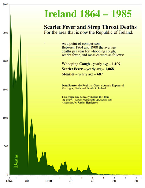
Links to data sources:
The Registrar-General Annual Reports of Marriages, Births and Deaths in Ireland.
Northern Ireland 1912 - 1995
Left to right - whooping cough, measles, scarlet fever.


Data Source - Registrar General Historical Reports Northern Ireland
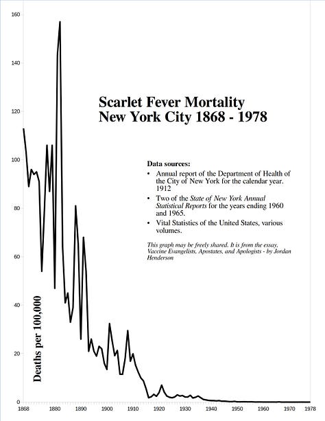
New York City 1868 - 1978
Left to right - whooping cough, measles, scarlet fever.
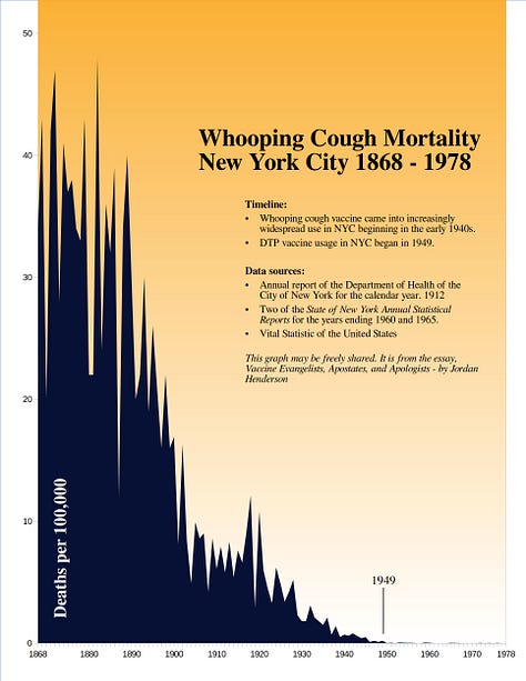


Links to data sources:
Annual report of the Department of Health of the City of New York for the calendar year 1912
Annual report of the State Department of Health of New York 1960
Annual report of the State Department of Health of New York 1965
Vital Statistics of the United States
Norway 1869 - 2016
Left to right:
Top row - whooping cough, measles.
Bottom row - scarlet fever, diphtheria.
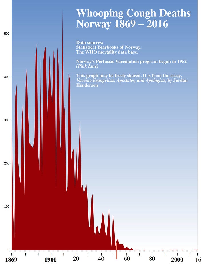

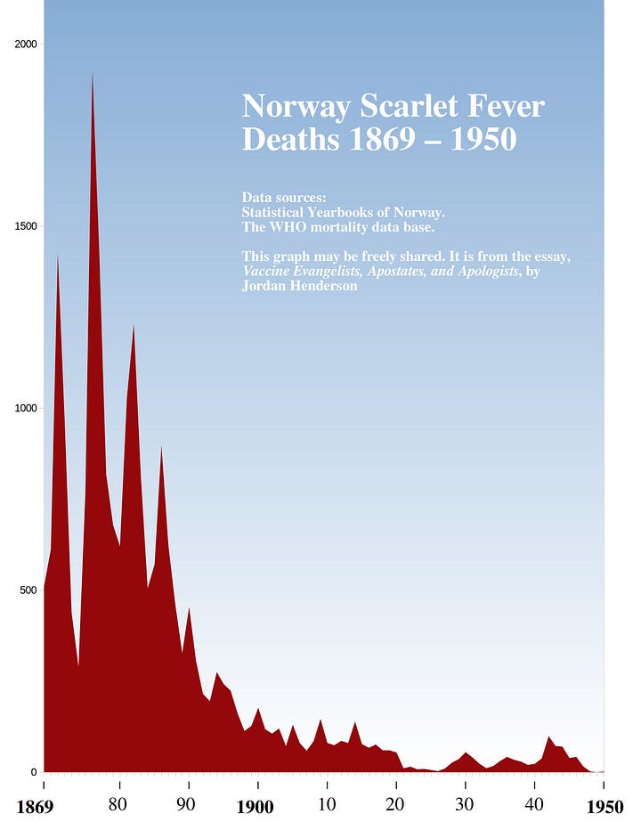

Links to data sources:
The Norwegian Statistical Yearbooks.
New Zealand 1881 - 2016
Left to right
Top Row - whooping cough, measles, scarlet fever.
Bottom Row - diphtheria, pulmonary tuberculosis, typhoid fever.
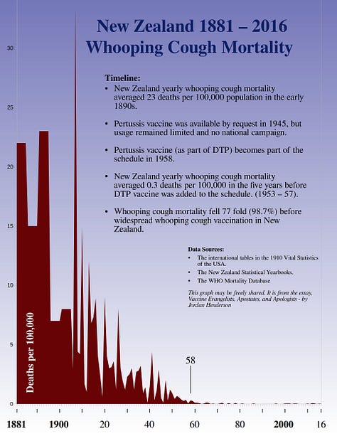


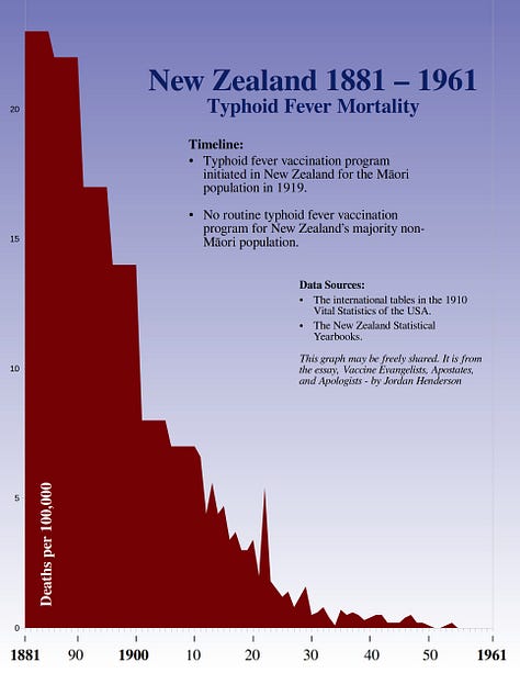
Links to data sources:
The Statistical Yearbooks of New Zealand.
The 1910 Vital Statistics of the United States (the international tables).
Glasgow, Scotland: 1881 to 1970
Left to right - Whooping Cough, Measles, Scarlet Fever.

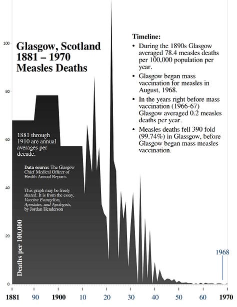
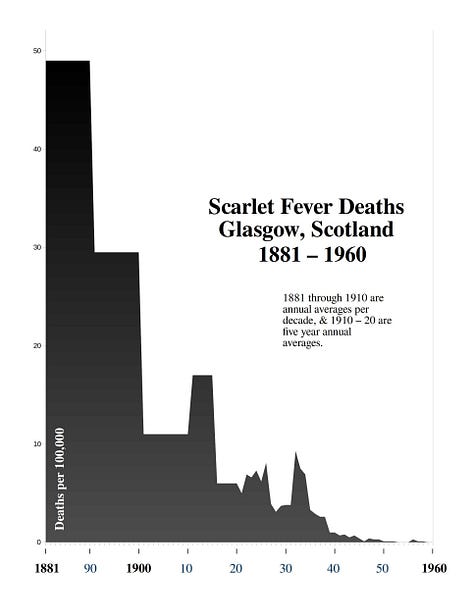
Data source: Glasgow Chief Medical Officer of Health Annual Reports. You can find digital archives of all these reports from 1900 through 1973 in the Wellcome Collection.
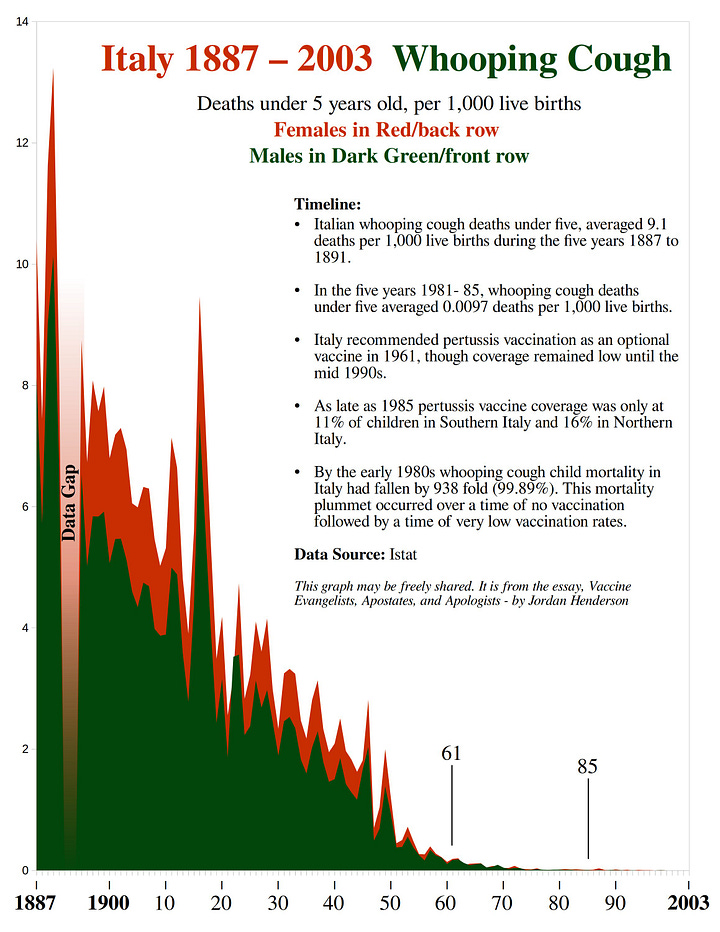
Italy 1887 - 2003
Left to right.
Top Row - whooping cough - big picture view, and detail view.
Bottom Row - measles - big picture view, and detail view.

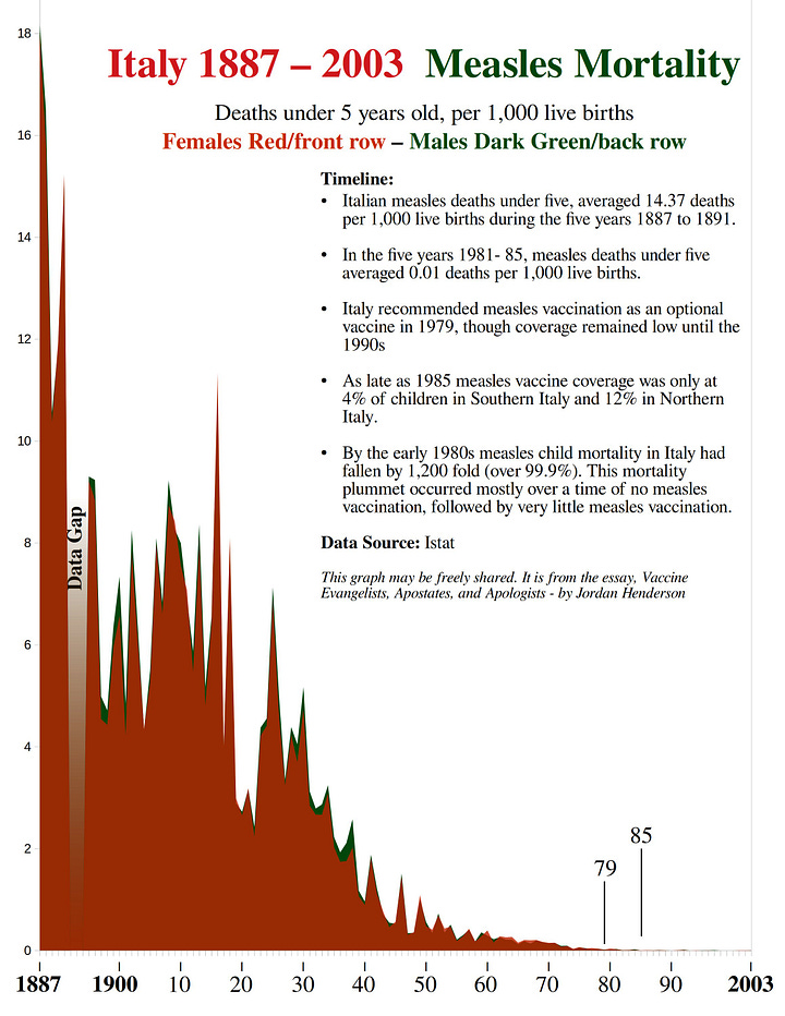

Italy Continued
Left to right
Top Row - meningitis, tuberculosis, malaria.
Bottom Row - pneumonia/etc, gastritis/etc, child mortality.
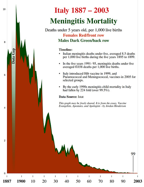
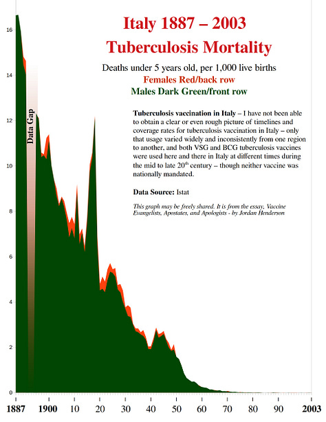


Data source: The data spreadsheets provided by the Italian National Statistics Institute (Istat) in their 2014 press release Child mortality yesterday and today in Italy.
Spain 1900 - 1990
Left to right.
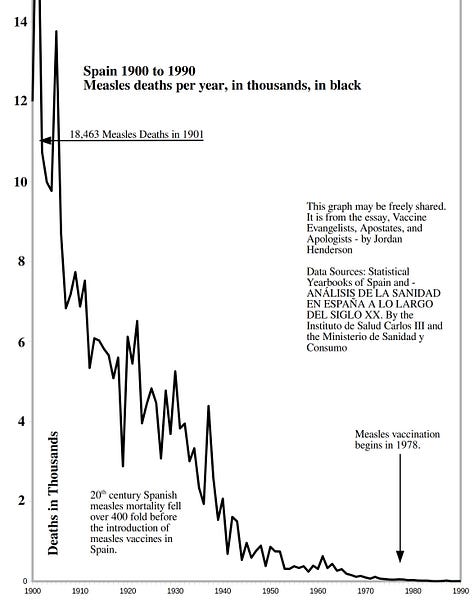
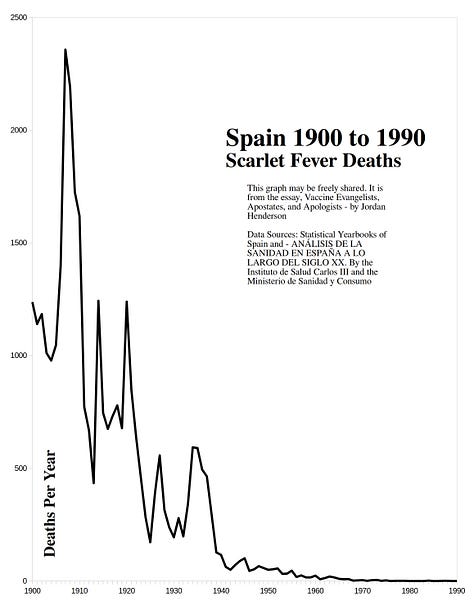
Top Row - whooping cough, measles, scarlet fever.
Middle Row - diphtheria, typhoid, tuberculosis.
Bottom Row - pneumonia, influenza, infant mortality rate.
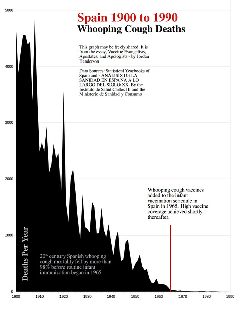
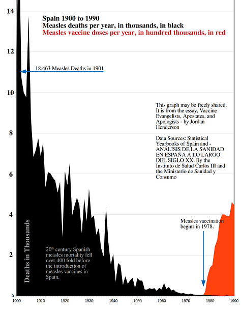

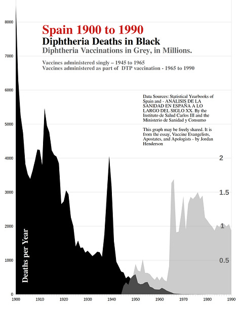
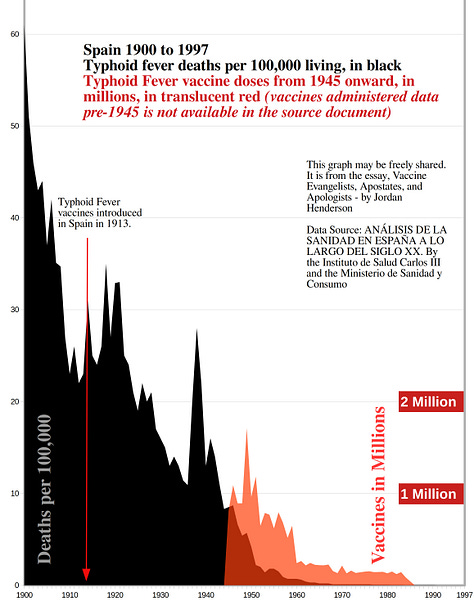
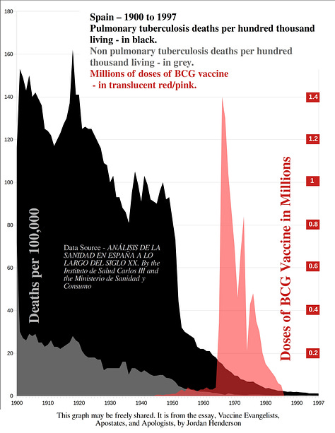
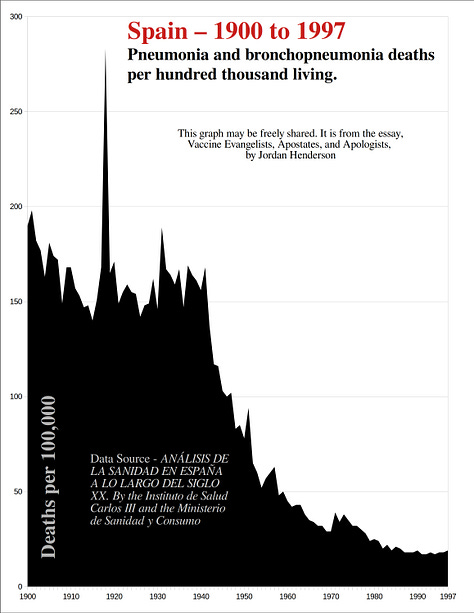
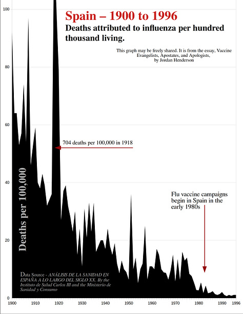
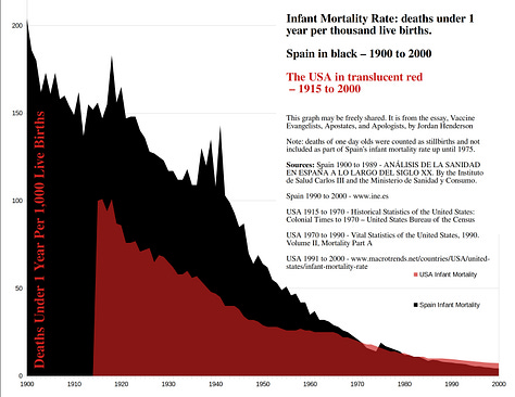
Spain Continued
Bellow - Left to right.
Top Row - comparative mortality.
Middle Row - meningitis, bronchitis, diarrhea & enteritis.
Bottom Row - population growth, live births.


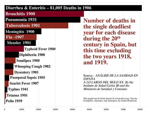


Links to Data Sources:
Analysis of Health in Spain Across the 20th Century (the graphs with writing in Spanish are screenshots directly from this publication, and I used tables from this publication for at least some of the decades in most the graphs I created).
The statistical yearbooks of Spain
Graphs for the USA, one for France, a couple for Switzerland & Miscellaneous Graphs
Left to right.
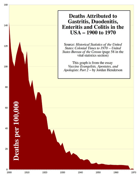
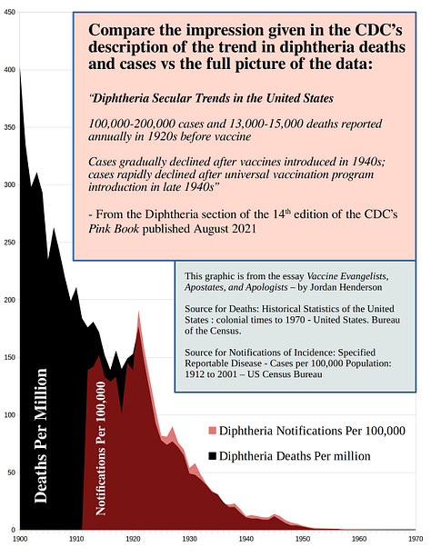
Top Row - 1. Tuberculosis USA, 2. Gastrittis Enteritis USA, 3. Diphtheria death and case notifications rates USA.
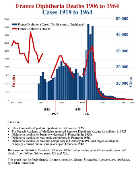
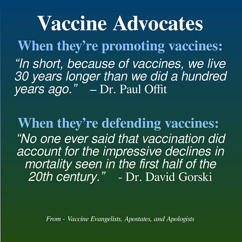
Middle Row - 4. whooping cough, measles, scarlet fever USA. 5. diphtheria deaths and case notifications France. 6. Drs Offit and Gorski meme.
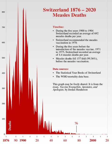
Bottom Row - 7 Infographic illustrating pro-vaccine misdirection. 8 Measles deaths Switzerland 1876 to 2016. 9 Scarlet fever deaths Switzerland 1876 to 1976.




Links to Data Sources:
1966 Statistical Yearbook of France
Statistical Yearbooks of Switzerland 1910, 1950, 1980
Selection of Graphs as Black and White Line Graphs for Easy Printing (minimal ink needed to print them).
Left to right.
Top Row - Whooping Cough in: 1. Sweden. 2. Spain. 3 New York City
Middle Row - Measles -in: 1. Sweden. 2. Spain. 3 New York City
Bottom Row - Scarlet Fever in: 1. Sweden. 2. Spain. 3 New York City

Links to web pages with historical mortality graphs juxtaposed with vaccination for more countries and places.
For England and Wales (including for Smallpox) from 1838, the USA from 1900 to the late 20th century, and the state of Massachussets from the 1860s, see the graphs by Roman Bystrianyk and Suzanne Humphries at Dissolving Illusions.
For mortality from whooping cough, measles, scarlet fever and more, in the country and continent of Australia from 1870 to the late 20th century see the graphs by Greg Beattie at Vaccination Dilemma.


That's quite the picture you've painted.
Having just looked at all the graphs, I'm left with the clear impression that the vast majority of these vaccines were introduced as solutions to problems that no longer existed.
It's also clear that the vaccines that were introduced earlier — when the diseases were still somewhat significant — and appeared as though they may have caused disease reduction, would, if only they'd been introduced a bit later, have also been brought in when the problems no longer existed.
Which is to say, that the picture you've painted leads me to suppose that it's the engineers and not the vaccinators who've knocked down disease, i.e., clean water and sanitation, as opposed to vaccines.
Wow! I love to see this!